An image campaign was meant to show what OSD truly stands for. It needed to reflect closeness and strong regional roots while remaining scalable across multiple channels. The challenge was to bring together stakeholders from marketing, newsroom, and social media in a co-creation process. A tight timeline and broad target groups ranging from 18 to 39 added further complexity.
Ostsächsische Sparkasse Dresden – From Account Balance to a Sense of Home
According to recent survey results, Ostsächsische Sparkasse Dresden faced a challenge: customer service and the branch network were valued, yet pricing and overall satisfaction ranked below average. At the same time, the analysis revealed promising potential to win over customers willing to switch from competitors. On top of that came a dual task – strengthen the brand image while preparing public approval for updated terms and conditions. The opportunity was there. It simply had to be seized without misstepping.
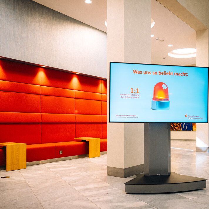
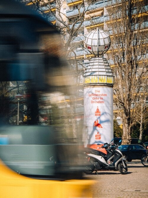
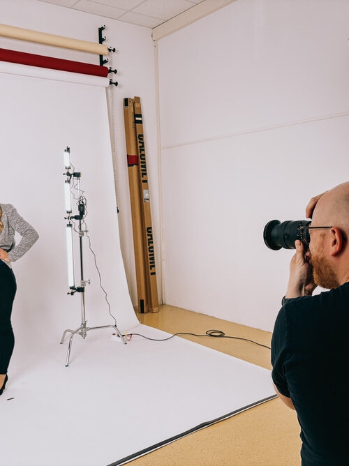
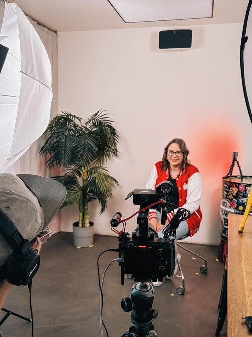
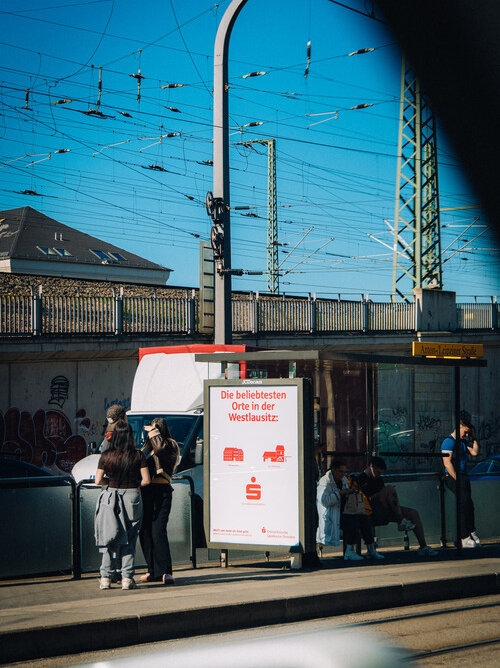
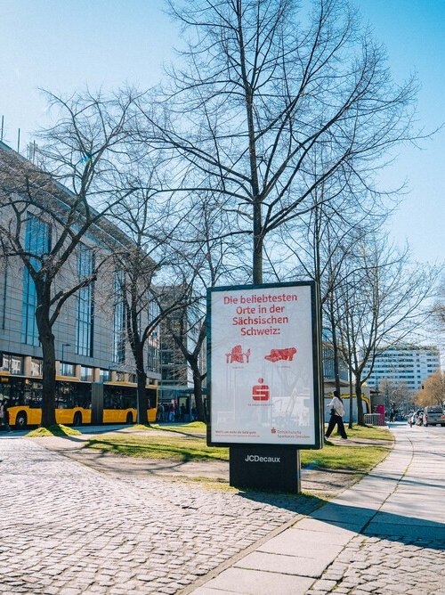
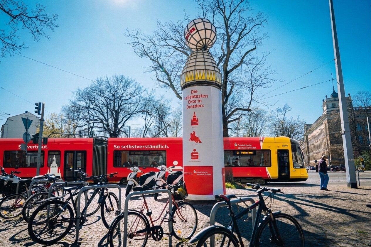
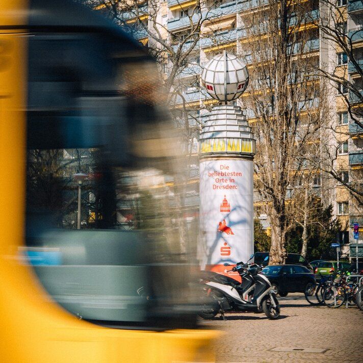
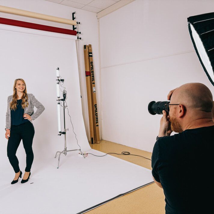
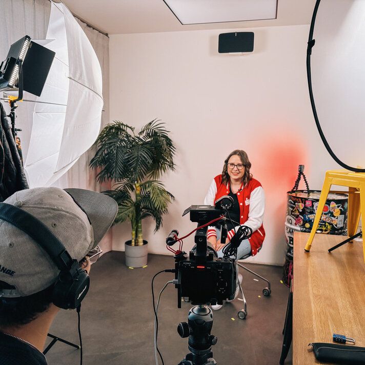
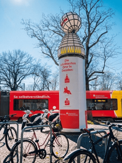
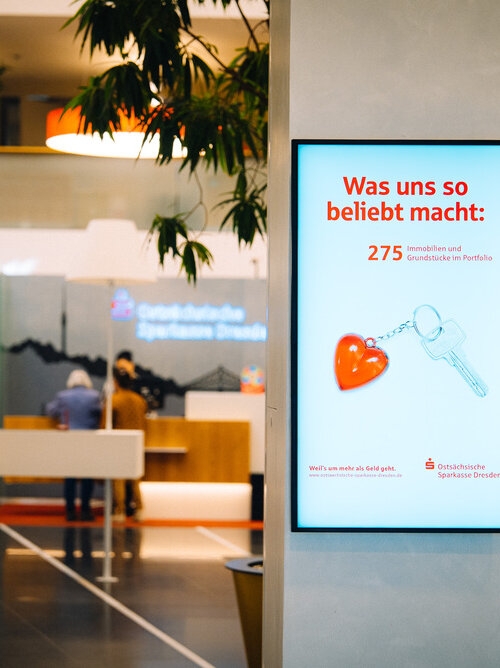
We worked in two phases – first understand, then create. Eight qualitative expert interviews and a quantitative survey conducted with our co-creators at Civey provided clear insights. The Sparkasse is deeply rooted in the region – not only through local sponsorships, but especially through approachable, personal advisory services in numerous branches and through a comprehensive ATM network. From this, we jointly developed the core idea “So beliebt, so vertraut, so selbstverständlich.” (So popular, so familiar, so natural.) along with two creative lines. The first line used stylized icons from landmarks across the eight business regions, such as the Frauenkirche for Dresden, the Bastei for Saxon Switzerland, and St. Marienstern Monastery for West Lusatia. The second line focused on USP-driven motifs highlighting branches, ATMs, mobile payment, and security. The distinctive element was the clean campaign design – typography and icons only, in Sparkasse red. In addition, we produced in-house photo and video content featuring OSD employees to create a “I know them from the poster” effect.
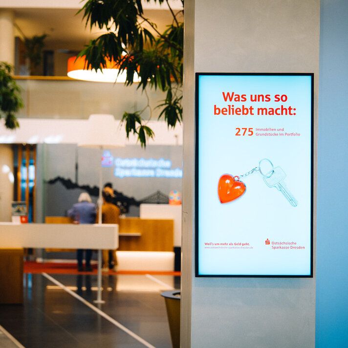
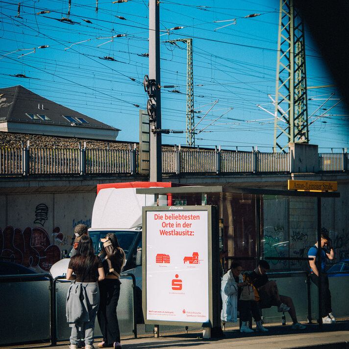
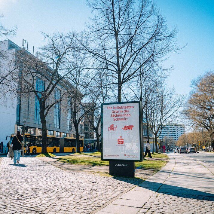
Nine regional motifs, ten product motifs, and several social media reels later, the campaign took off. We rolled it out across all touchpoints – posters, city light posters, Litfaß columns, a fully wrapped tram, buses, carousel ads, reels, stories, and radio spots. The combination of emotional regional identity and quantified promises such as “21,000 ATMs nationwide” ensured citywide visibility. The strongest feedback centered on the employee motifs. The personal visuals resonated so strongly that they were extended into the following year – proof of how essential personality and personal advisors are as a USP. Exactly where life happens. So popular, so familiar, so natural.
An image campaign was meant to show what OSD truly stands for. It needed to reflect closeness and strong regional roots while remaining scalable across multiple channels. The challenge was to bring together stakeholders from marketing, newsroom, and social media in a co-creation process. A tight timeline and broad target groups ranging from 18 to 39 added further complexity.
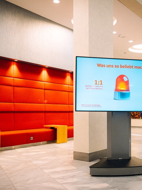
We worked in two phases – first understand, then create. Eight qualitative expert interviews and a quantitative survey conducted with our co-creators at Civey provided clear insights. The Sparkasse is deeply rooted in the region – not only through local sponsorships, but especially through approachable, personal advisory services in numerous branches and through a comprehensive ATM network. From this, we jointly developed the core idea “So beliebt, so vertraut, so selbstverständlich.” (So popular, so familiar, so natural.) along with two creative lines. The first line used stylized icons from landmarks across the eight business regions, such as the Frauenkirche for Dresden, the Bastei for Saxon Switzerland, and St. Marienstern Monastery for West Lusatia. The second line focused on USP-driven motifs highlighting branches, ATMs, mobile payment, and security. The distinctive element was the clean campaign design – typography and icons only, in Sparkasse red. In addition, we produced in-house photo and video content featuring OSD employees to create a “I know them from the poster” effect.
Nine regional motifs, ten product motifs, and several social media reels later, the campaign took off. We rolled it out across all touchpoints – posters, city light posters, Litfaß columns, a fully wrapped tram, buses, carousel ads, reels, stories, and radio spots. The combination of emotional regional identity and quantified promises such as “21,000 ATMs nationwide” ensured citywide visibility. The strongest feedback centered on the employee motifs. The personal visuals resonated so strongly that they were extended into the following year – proof of how essential personality and personal advisors are as a USP. Exactly where life happens. So popular, so familiar, so natural.