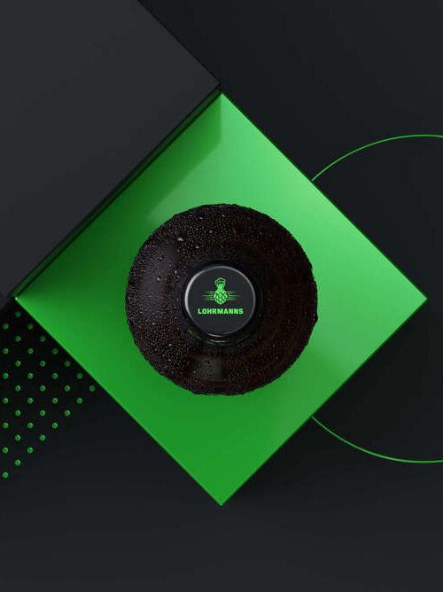
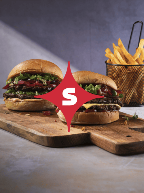
In a two-day workshop with marketing, sales and foodservice experts, we developed the new brand identity. The recipe: strategic analysis, ideation and structured discussions. The result was the Brand Holosphere, which defines SALOMON as a “creative catalyst”, “reliable companion” and “forward-thinking solution provider”. We built the entire corporate design around this: the “fixed star” in the new logo provides orientation – a simple, memorable symbol of pioneering spirit and reliability. The dynamic colour system adds spice with natural colours ranging from menthol to wasabi, from pumpkin to green sage. We came up with the colour names; the inspiration came from the product world.
Salomon FoodWorld – A mainstay in the foodservice industry
SALOMON FoodWorld is the market leader in foodservice. As a trendsetter in the food industry, the company faced the challenge of visually embodying this pioneering role. The existing brand identity was no longer keeping pace. Added to this was the complexity: different markets, two sub-brands and an enormous range of products, from finger food to vegan alternatives. Our mission was the holistic development of the brand identity and corporate design. Revolution rather than evolution. A system that blends reliability with innovative strength, remains flexible enough to grow alongside the next food trends, and does not lose its character in the process.
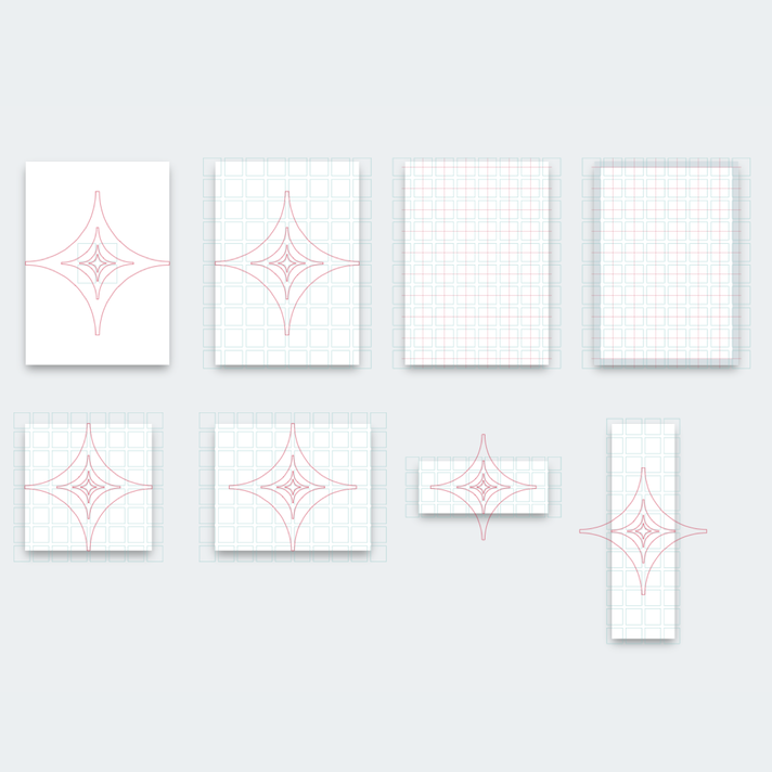
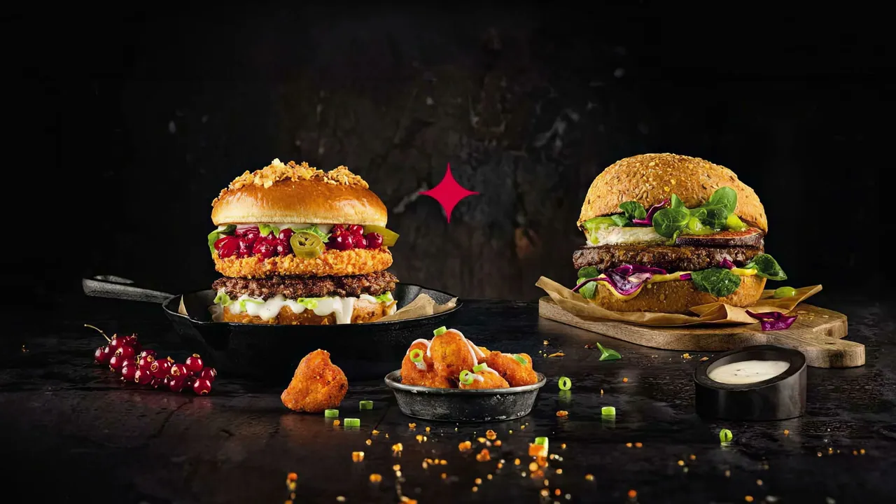
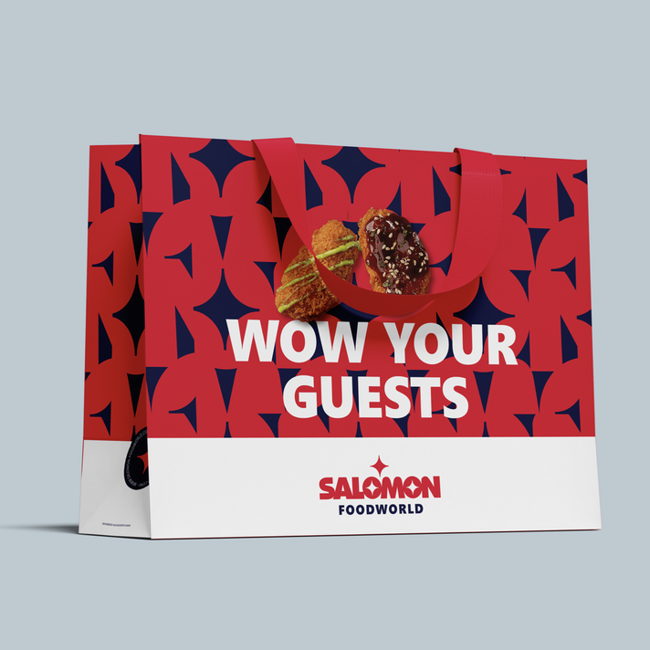
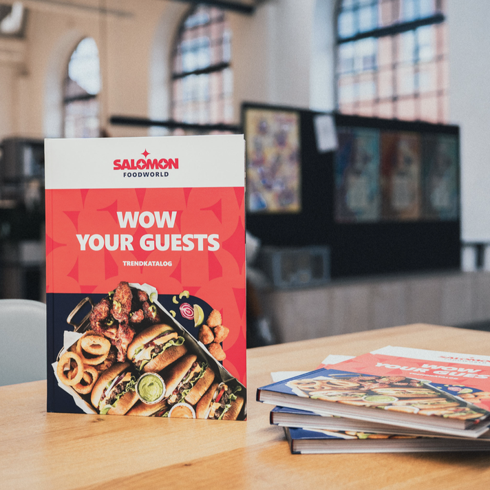
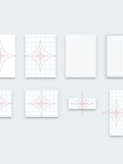
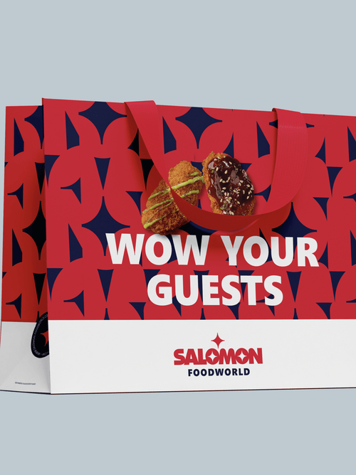
The typography combines character with effectiveness: Segoe UI as a system-independent primary typeface for quick usability, Besley Regular for distinctive accents, and a bespoke SFW font for icons. The Bento Box grid system presents the product range in an appealing way. A clear information hierarchy with maximum flexibility. To this end, we developed a pattern system derived directly from the logo that brings the design to life. The patterns are ingredients for variety without arbitrariness. The ‘rounded corner’ as a distinctive design element makes SALOMON recognisable at every touchpoint. The four-tiered visual world showcases everything from the product and preparation to the world of gastronomy. This is how we whet the appetite for food.
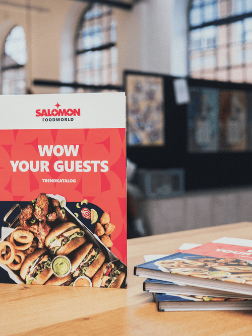
The result is impressive: a brand manual that combines a refined brand identity with a completely new corporate design. The fixed star functions both as a standalone logo and as the foundation for the entire design system – from business stationery and product catalogues to digital touchpoints. The new brand identity reinforces the company’s self-image internally. Externally, SALOMON clearly sets itself apart from the competition through its vibrant design language. The positive internal feedback and the swift, active adoption of the design confirm that SALOMON FoodWorld is now visually where it has always been in terms of content – right at the forefront. The fixed star for guidance and trends.

In a two-day workshop with marketing, sales and foodservice experts, we developed the new brand identity. The recipe: strategic analysis, ideation and structured discussions. The result was the Brand Holosphere, which defines SALOMON as a “creative catalyst”, “reliable companion” and “forward-thinking solution provider”. We built the entire corporate design around this: the “fixed star” in the new logo provides orientation – a simple, memorable symbol of pioneering spirit and reliability. The dynamic colour system adds spice with natural colours ranging from menthol to wasabi, from pumpkin to green sage. We came up with the colour names; the inspiration came from the product world.
The typography combines character with effectiveness: Segoe UI as a system-independent primary typeface for quick usability, Besley Regular for distinctive accents, and a bespoke SFW font for icons. The Bento Box grid system presents the product range in an appealing way. A clear information hierarchy with maximum flexibility. To this end, we developed a pattern system derived directly from the logo that brings the design to life. The patterns are ingredients for variety without arbitrariness. The ‘rounded corner’ as a distinctive design element makes SALOMON recognisable at every touchpoint. The four-tiered visual world showcases everything from the product and preparation to the world of gastronomy. This is how we whet the appetite for food.
The result is impressive: a brand manual that combines a refined brand identity with a completely new corporate design. The fixed star functions both as a standalone logo and as the foundation for the entire design system – from business stationery and product catalogues to digital touchpoints. The new brand identity reinforces the company’s self-image internally. Externally, SALOMON clearly sets itself apart from the competition through its vibrant design language. The positive internal feedback and the swift, active adoption of the design confirm that SALOMON FoodWorld is now visually where it has always been in terms of content – right at the forefront. The fixed star for guidance and trends.